
Project: JNCHES vs Inflation
We're happy to announce a new UCU Commons Project: JNCHES vs. Inflation. We've extracted pay spine point data going back to 2005 and plotted it in a number of ways against several inflation measures.

I've been working on some UCU related projects. These mostly revolve around making something complex more intelligible usually via better organisation, navigations tools, and data presentation. Last started and first shared is my alternative Congress motion browsers and notetakers. It gives easy, non-linear access to motions while retaining situational awareness of the schedule (e.g., sidebar based, clickable table of contents) as well as easy, motion connected and even multi-user note taking. Back in the day, the TL:DR series was a more discursively oriented project. These days I'm doing more data and numeric modelling projects. The first of these I'd like to present is JNCHES vs Inflation.
You can read a ton of detail on the About page, but the basic idea is "Given a start date and spine point, how much value has your salary lost." The headline from UCU is "30% since...[2009, I think]". They even have a tool where you can enter some of your details and see what you've lost. But, as I wrote on the About page:
I don't think the UCU pay modeller has the same focus. We converge on same results (assuming similar inputs) (yay!), but:
- You don't see anything until you've entered some numbers. That inhibits various uses.
- It is tedious to compare things. I love me a good default but I do think being able to delve is critical. So being able to test CPI vs. RPI, starting points, and see multiple spine points makes a big difference for many uses. Also, you can guesstimate where you are just from my initial graph with default values. That's good for sharing.
- UCU didn't release the data they extracted. It was annoying to extract the spine point data even with Claude assisting. It's in PDFs because UCEA sucks. I think this is useful data to have for other projects including by other people!
I'd be happy if UCU wanted to blend this into their tool! I have loads of ideas for further enhancments, so check out the About page. Happy to hear any other ideas! Some things (like FE pay analysis or HE grade comparisons) requires data gathering I would need a fair bit of help on.
This graph is powerful (or depressing or powerfully depressing):
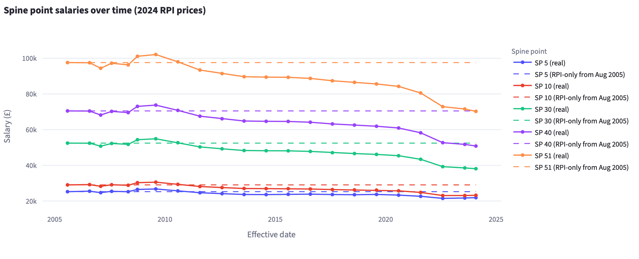
You can lose 10 spine points of purchasing power over 20 years.
As the kids probably no longer say: That ain't right.
Of course, so many of our friends and coworkers have lost their jobs, or are currently fighting to save jobs, or will soon be out of a job with no prospects of staying in the sector, or have been working in bits and bobs for decades to be silently sloughed off , or have hopes for a career that has essentially no chance is an abomination.
This data doesn't cover any of that. I recommend consulting the QMUCU "HE shrinking" page for a view into the state of "obvious" redundancies. For some insight into hidden redundancies, please consult the report, Universities Degraded, by Becca Harrison and David Harvie. It uses a survey of members to try to tease out estimates of the full impact of HE's contraction on university workers. You might also be interested in the work of UCU's Anti-Casualisation Committee.
There's a lot going on in our sector and I find it challenging to both keep a clear overview and be able to drill into detail on demand. I hope this little tool is helpful for others.